

Founded
2024
Type
SaaS
Location
USA
Team
2-10
Meet FlowPay: Your Billing Stack for Webflow Creators
FlowPay is a purpose-built billing and payments platform for Webflow users, agencies, freelancers, and studios. They hired us to design a bold, trustworthy identity and build a website that clearly explains what it is, who it’s for, and how it works in under 5 seconds.
1. Targeted Messaging
Built for Webflow power users, not general SaaS buyers
2. Visual Credibility
Needed to stand out among dev tools and design software
3. Conversion Clarity
The site needed to convert high-intent traffic into demo bookings
2. The Stakes
Why It Mattered: Great Product, But No One Got It
FlowPay was solving a clear pain for Webflow freelancers, but their site didn’t make that obvious. Without a crisp message and focused site experience, warm leads bounced, and cold leads stayed cold.
1. Clarity Risk
Buyers couldn’t see why FlowPay mattered.
2. No sharp promise
The homepage buried what made the product unique.
3. Sales momentum slowed
Even warm leads needed re-explaining mid-funnel.
3. The Challenge
What Could Have Gone Wrong: How We Made Sure It Didn’t
Early-stage SaaS teams often overexplain the tech and underplay the value. The risk? A homepage that’s beautiful but toothless, no clarity, no urgency, no conversion path. FlowPay was headed down that road. We stopped it before it cost them trust and growth.
1. Generic startup speak
We stripped out the buzzwords and made the copy buyer-focused and product-specific.
2. No jargon
We avoided over-designing and built a clean, Webflow-native UI system that feels familiar to creators.
3. No emotional hook
We led with pain and built a narrative around solving it, not just listing features.
4. The Strategy
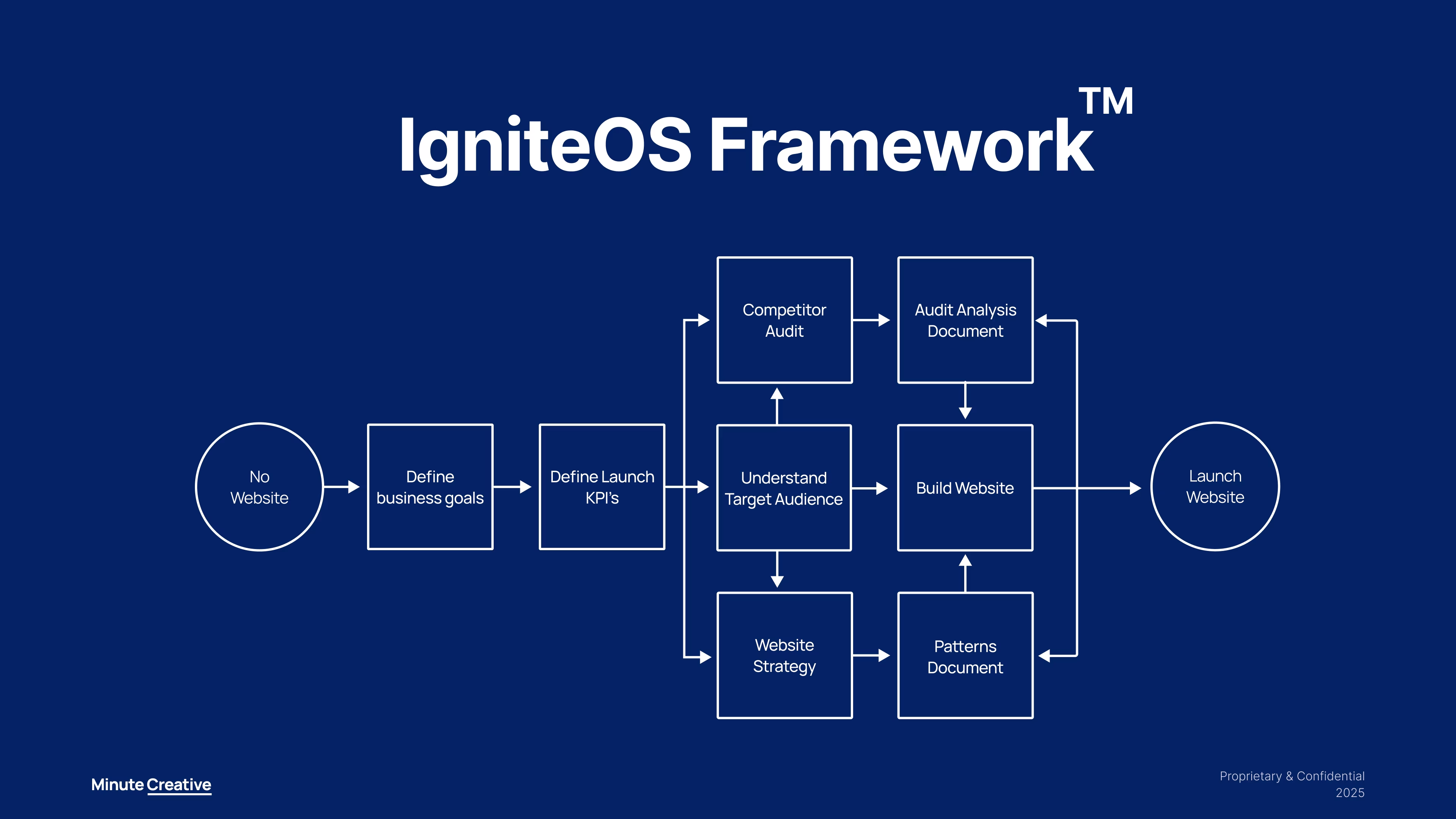
The Conversion Core™: From Noise to Narrative in One Sharp Sprint
We applied our Conversion Core™ framework, a focused process designed to help SaaS teams go from “We built something great” to “Now our site sells it.” For FlowPay, this meant distilling the product’s value, aligning it with real buyer pain, and building a site that made people want in.
1. Sharp positioning
We anchored everything around one promise for “Billing made for Webflow pros.”
2. Messaging with intent
Every section followed a flow: pain → promise → proof → path. No fluff, no filler.
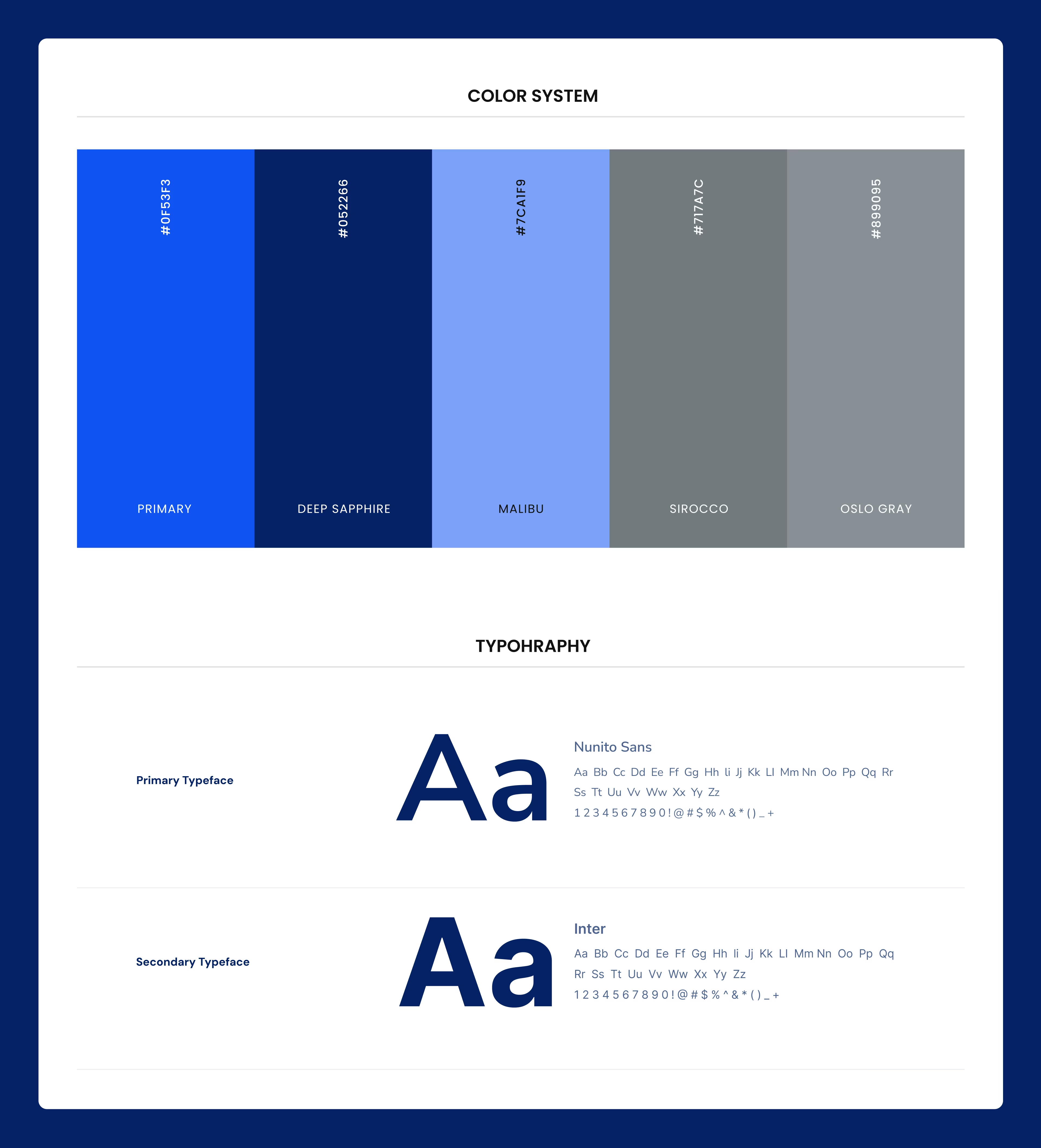
3. Designed for trust
We designed a UI system that communicates trust in 3 scrolls or less.
5. The Execution
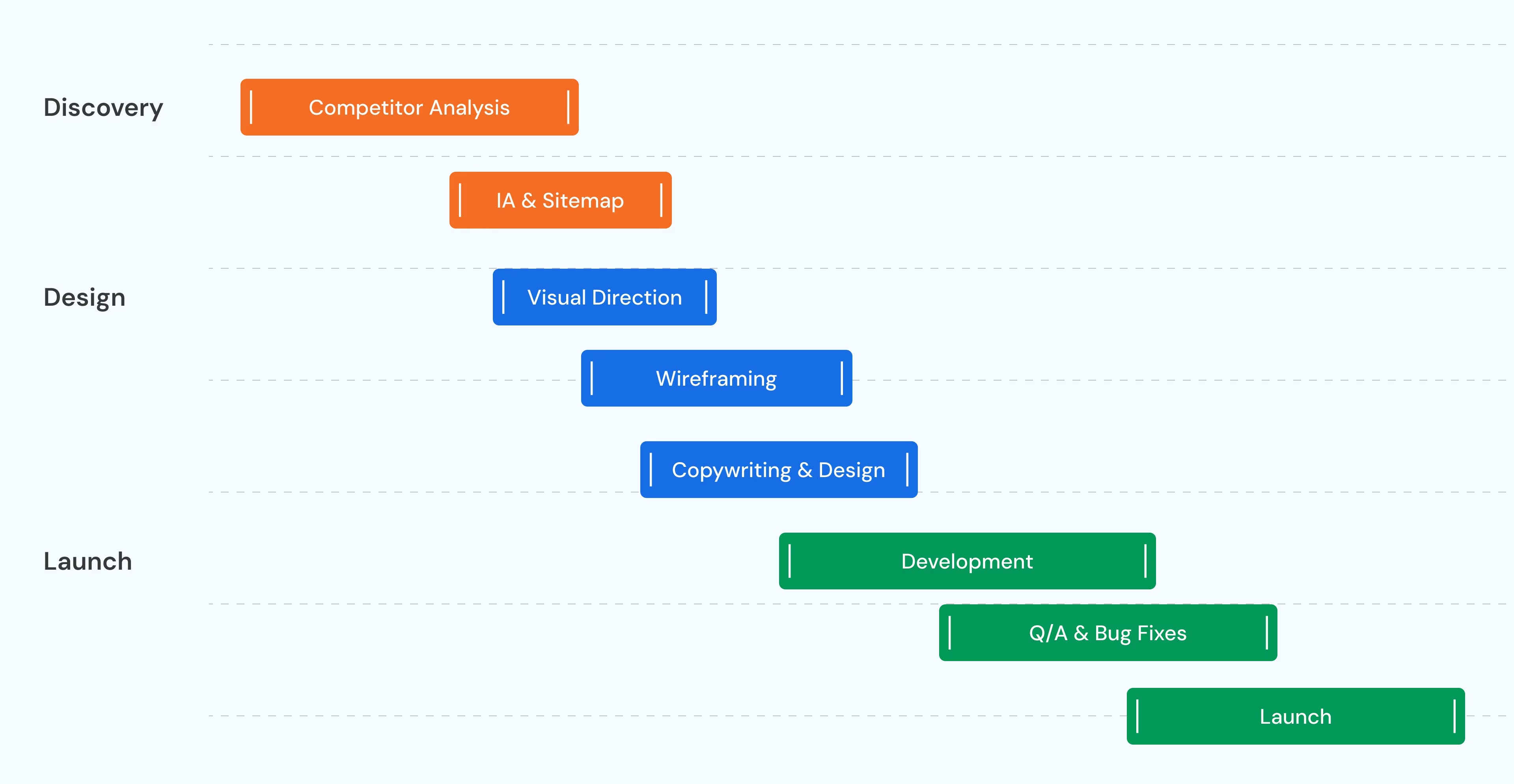
How We Made It Real: From Vision to Conversion in 30 Days
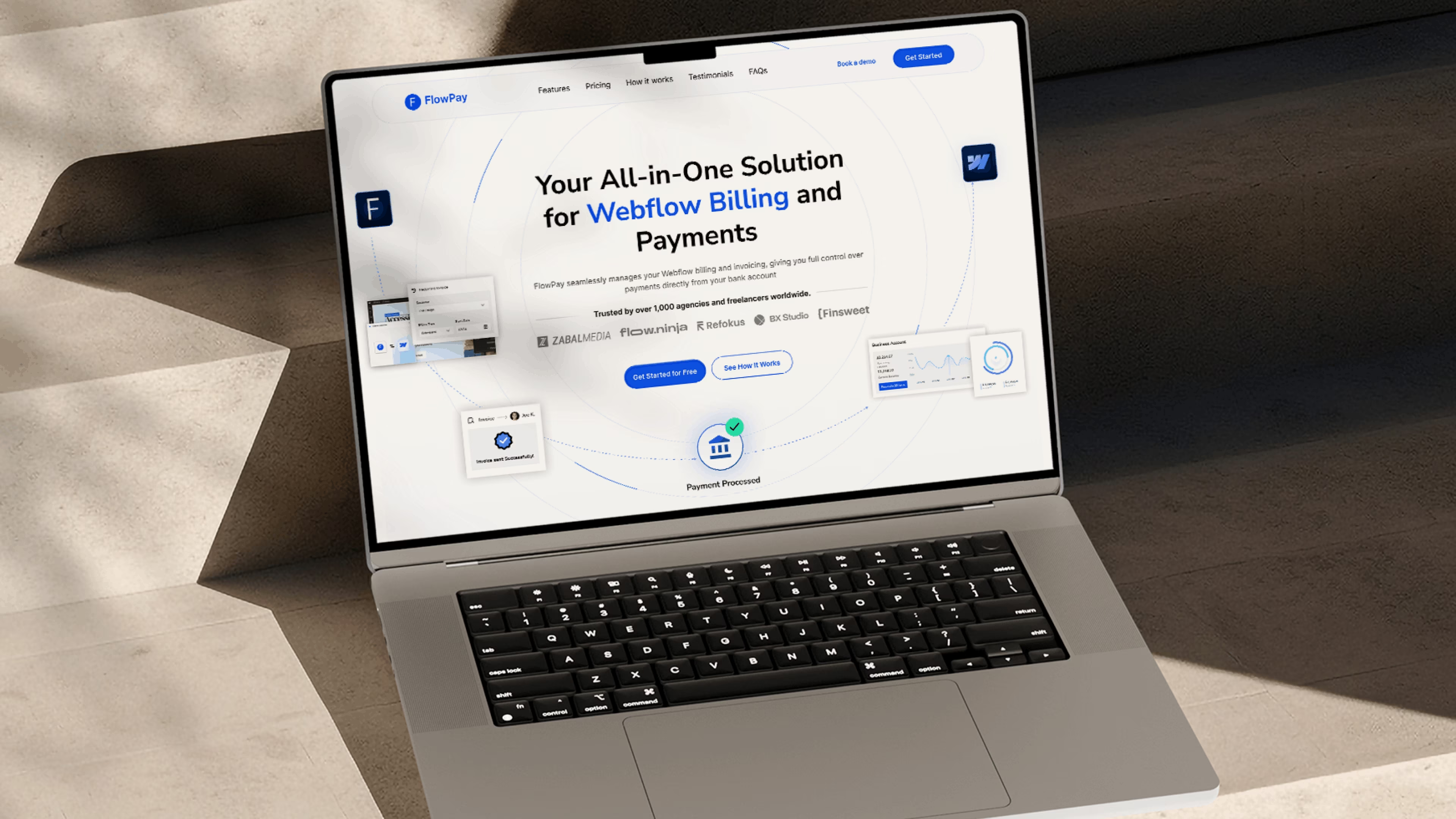
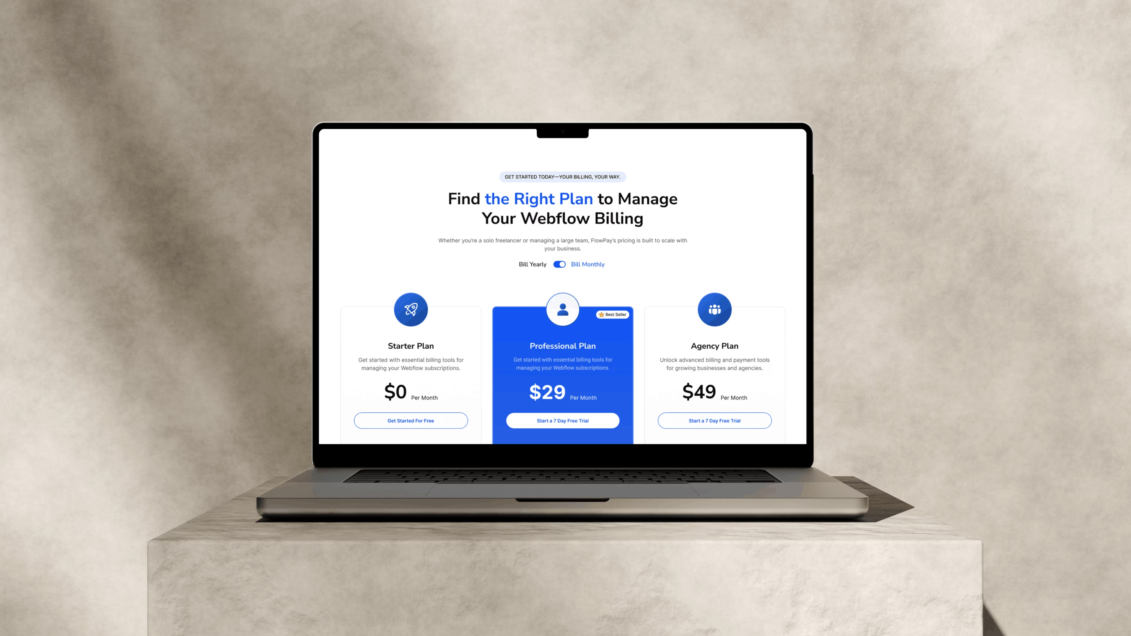
We translated the strategy into a high-conversion site that felt trustworthy, product-focused, and founder-worthy. Every element from color to copy was built around speed, scroll behavior, and getting to “I get it” faster.
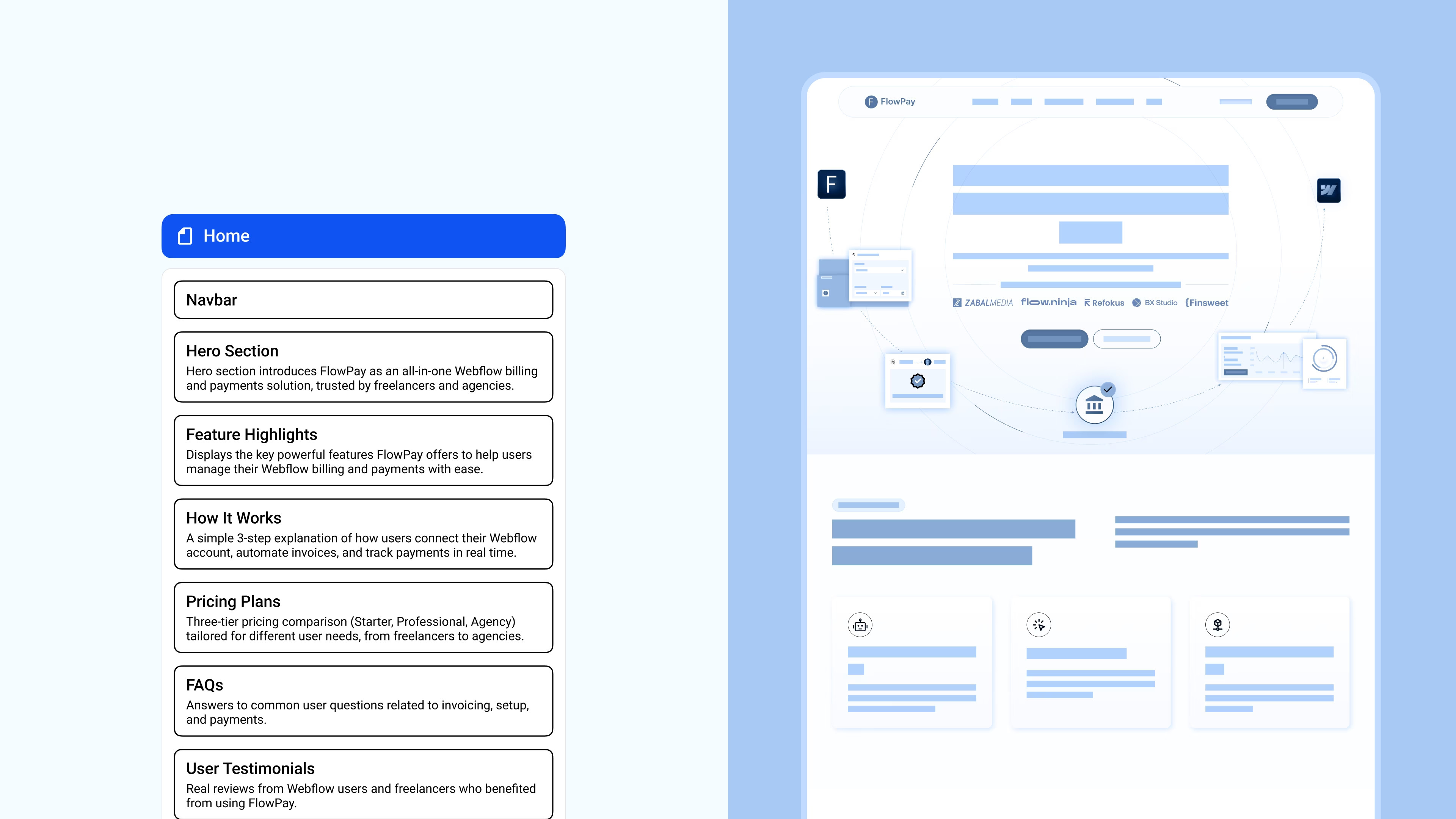
1. Messaging-led UI
We wrote the homepage copy before designing anything, to make sure the story came first.
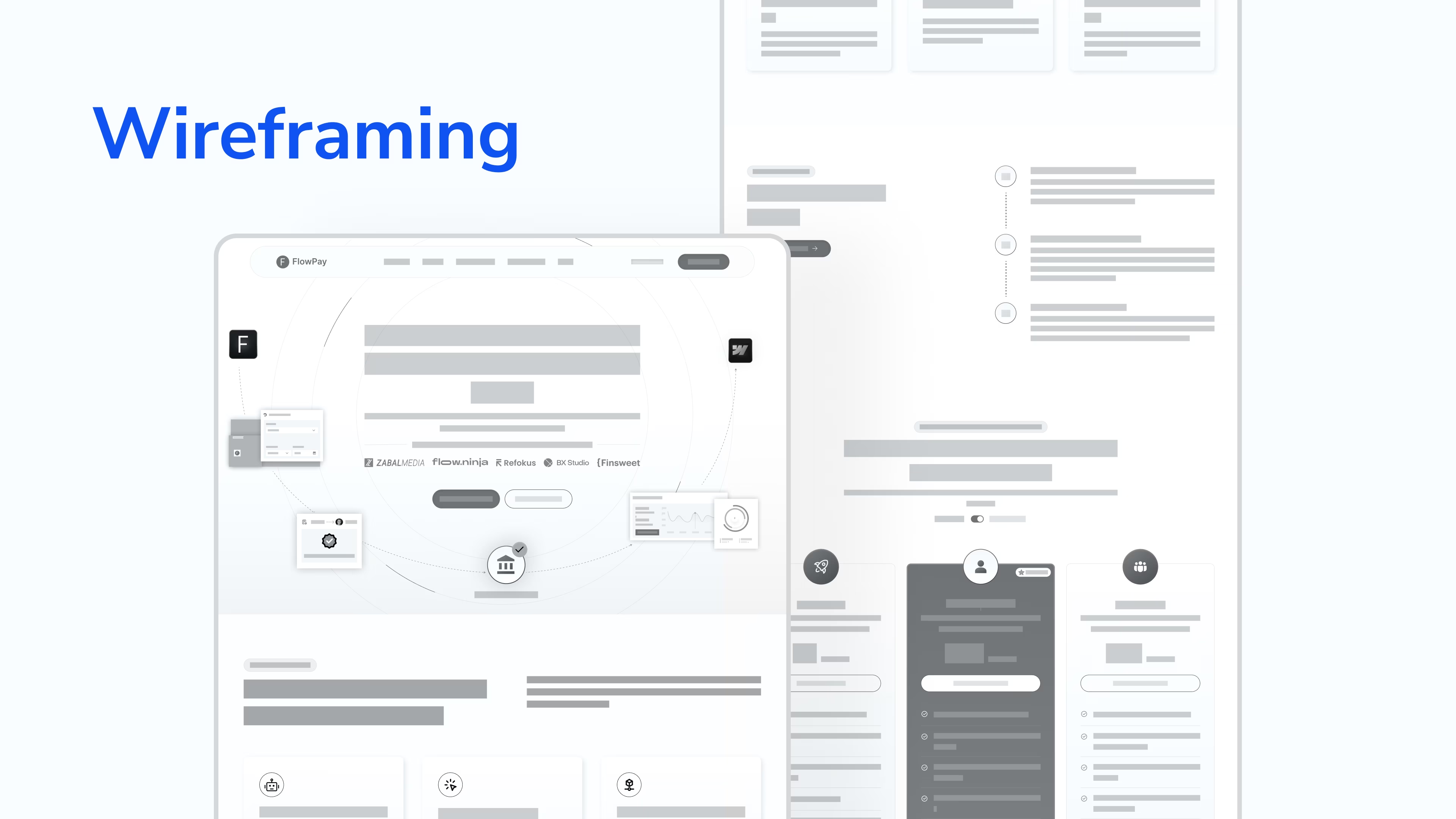
2. Website Strategy + Wireframes
Designed a system that felt native to the Webflow ecosystem and credible to freelancers.
3. High-Fidelity UI and Build
Prioritized trust signals, demo triggers, and product clarity above the fold.
4. Built for speed
Final designs were handed off Webflow-ready, clean, mobile-first, and light on bloat.
We didn’t just make it look better. We made it work for buyers, not just browsers.

6. The Results
The Outcomes: Proof It Scales
After launch, FlowPay didn’t just look better, it converted better. Buyers understood the product faster. Sales teams spent less time explaining. And early traction started compounding.
7. Future Roadmap
Next Steps: From Site to Sales Leverage
With a sharp brand, clear messaging, and a high-converting website in place, FlowPay is now positioned to scale with speed and confidence. The foundation is set, and the next chapter is about amplification.
1. Use-Case Expansion
They are planning dedicated landing pages for agencies, freelancers, and studios, helping FlowPay speak directly to high-intent buyers with tailored proof and CTAs.
2. Scalable Content Engine
A repeatable content design system is in the works to fuel thought leadership, SEO, and link-building, turning insights into authority and traffic.
3. Ecosystem Positioning
FlowPay will deepen its visibility in the Webflow ecosystem through integrations, partnerships, and platform-first education, owning its niche from the inside.
8. Invitation
We Turn “What Do You Do Again?” into “Where Do I Sign?”
Confused buyers don’t convert. We help SaaS teams sharpen their messaging and launch sites that sell in 8 seconds or less.
Book a call w/ Harsh (Founder @ Minute Creative)
Want Us To Help You Scale Your Brand?
More Case Studies

CAMB.AI

Synapwiser
Website
Like what you see?
Let’s discuss your project